Leaving the Cell ○ Barbara Ellmerer

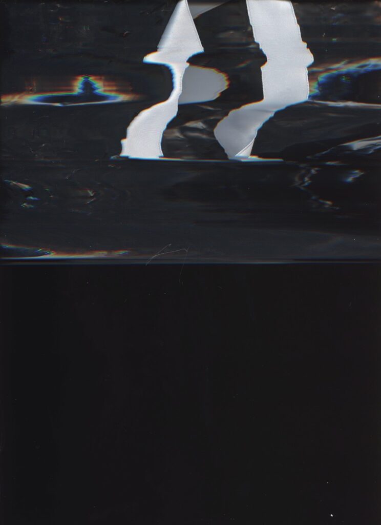
The following notes document the process that led me from an original image (Fig. 1) taken from a medieval illustrated manuscript of Boethius’ Consolatio Philosophiae towards my personal contemporary re-interpretation of the same image (“Target Image No. 5”; Fig. 2) by the medium of scanning.
I believe, one image is always the result of another image. In my case, the picture is the first of five in the manuscript of Boethius’ Consolatio in Berlin, Staatsbibliothek, Ms. lat. fol. 25, 86v. All five images show Lady Philosophy (Philosophia) and Boethius in conversation. I had the opportunity to physically examine them in the Staatsbibliothek Berlin and evaluated them for their materiality, painting techniques and colouration. The size and weight of the manuscript was surprising and left a lasting impression. The haptic experience of the manuscript had a decisive influence on the further artistic process.
This particular manuscript was completed after the emergence of letter-press printing (1485). The illustrations within are attributed to a person called “SLY” or “Slyters”, of which little is known. One of the five pictures in the manuscript (127v) has bled severely, presumably the result of water damage. This bleeding suggests the use of egg tempera as painting medium, possibly also casein tempera, as the painting surface has a chalk-like texture. Common to all the illustrations is a strong luminosity of the colours, with a wide range between brightness and darkness.
Back to “my” picture, the first one in the manuscript (86v; Fig. 1), also the first to be “interviewed” in Courcelle’s monography on Boethius’ Consolatio (Courcelle 1967, 94), a leading secondary source on the reception of Boethius’ work in the Middle Ages.
The picture shows the captive Boethius miserably lying on a day bed in conversation with Lady Philosophy while in company of three further female characters, identified in the text as three muses.
The room in the illustration, a dungeon or prison, has a certain ambience. The dark bars on the windows keep us from an outside that looks particularly attractive for the relatively pronounced depth of field in the landscape (pale green and pale blue). The horizon is almost white and points into an infinite depth of space.
The interior is cosy. A high wooden ceiling offers protection, as does the wooden throne-like divan on which Boethius is resting. Remarkably, Philosophia has taken a seat on the divan at Boethius’ feet. The deep black colour of her veil, attached to a diadem, gives her head dignity and authority and a reference to space and depth. From underneath her dress, made from a baroque, brocade-like fabric in gold ochre, scarlet red and light blue colours, the contours of her body are clearly visible. It is striking that only Philosophia’s garment has ornamental decorations, in the form of a simplified circular sun sign, with which the brocade-like fabric is covered.
The ornament is particularly important to recognise and identify Lady Philosophy as herself as she appears a second time in the same illustration, in standing posture in a separate “insert” in the top right corner of the image. That insert shows her within an exterior setting, thus suggesting that she – in difference to Boethius – is free to leave the room. While Philosophia is instantly recognisable through her dress and hairstyle, her robe in the insert is additionally adorned with miniature text.
The garments of the other female figures (the muses) are kept in the respective colours old rose, in shades of light green, and in a cerulean blue, giving them a dressed-up look, which is additionally emphasised by their opulent headdresses. Two of the muses are again shown twice – the second time from behind as if expelled through a door in the background.
All four female characters have thin textile-like ribbons rising from their heads, serving as “speech bubbles” inscribed with Latin text. It should be noted that the banner emanating from Lady Philosophy is the only one to reach beyond the frame reserved for the picture.
Boethius lies on the divan, wrapped in thick fabrics (dark red coat and blue headgear, both fur-trimmed), bearded, long-haired, massive. He is depicted with an open gaze from blue eyes, actively listening as he has no “speech banner”. The green of his divan blanket surrounds and highlights him. It is picked up in a brightened version in Philosophia’s insert in the upper right and in a darkened version in the robes of two of the muses.
A round wooden table dominantly placed in the lower centre of the picture carries Boethius’ writings and his writing utensils. We may distinguish a large quill, small pen, case, inkwell, book and notes. Several of these tools are kept in highly intense black (probably soot). It is the same black as used in Philosophia’s veil.
The narrowness of the space, which is hinted at by the perspective and accentuated by an achromatic, gloomy colour scheme, contrasts with the liveliness of the banners and thus with the freedom of the speech and the thoughts they probably symbolise. Weight versus lightness, material discrepancies. Two worlds collide: stone, wood, masonry versus fabric, paper snakes, air, wind.
I decided that my reaction to the illustration would be based on the textile-covered body parts of the figures, focusing especially on the ornaments, the fabrics and their colouring.
I further decided to think of the banners as textiles, as they appear flowing and light as if made of fine fabric. They surround the respective scenario and are, in places, delicately coloured. Formally, they seem to flow out of the protagonists’ heads and thus, symbolically, from their minds: moving, melodious, comforting, radiating harmony.

I began with a series of tests on the materiality of the building: stone, mortar, wall. On the way to my studio, I searched for suitable stones that could stand for the first part of the picture’s message, the architectural, the rigid part. The structural component of Boethius’ dungeon is created by means of the grey mottled structures in the material. A large split-off limestone I found seemed well suited to be scanned.


Barbara Ellmerer is a Swiss-Austrian painter and drawer, currently based in Zürich. She works in media such as oil painting, analogue and digital drawing, watercolour, printmaking and painting installation.
Recently she contributed to the research projects Iconography of Philosophy and Indirect Experiences.
#barbaraellmerer
KEYWORDS
illustration; philosophy; Boethius; text-image relations; textiles
REFERENCES
Boethius. Trost der Philosophie. Stuttgart: Reclam, 2016.
Boethius. Trost der Philosophie – Consolatio Philosophiae. Düsseldorf: Artemis & Winkler, 2015.
Courcelle, Pierre. La Consolation de Philosophie dans la Tradition Littéraire: Antécédents et Postérité de Boèce. Paris: Institut d’Études Augustiniennes, 1967.
Diedrichs, Christof L., and Carsten Morsch. “Bewegende Bilder: Zur Bilderhandschrift des Eneasromans Heinrichs von Veldeke in der Berliner Staatsbibliothek“. In Horst Wenzel, and Stephen Jäger, eds. Visualisierungsstrategien in mittelalterlichen Bildern und Texten. Berlin: Erich Schmidt Verlag, 2006.
Krämer, Sybille. “Die Schrift als Hybrid aus Sprache und Bild. Thesen über die Schriftbildlichkeit unter Berücksichtigung von Diagrammatik und Bild“. In Torsten Hoffmann, and Gabrielle Rippl, eds. Bilder. Ein (neues) Leitmedium? Göttingen: Wallstein, 2006.
Kiening, Christian. Fülle und Mangel: Medialität im Mittelalter. Zürich: Chronos Verlag, 2016.
Lutz, Eckart Conrad et al., eds. Lesevorgänge: Prozesse des Erkennens in mittelalterlichen Texten, Bildern und Handschriften. Zürich: Chronos, 2010.
Marenbon, John. Boethius. Oxford: Oxford University Press, 2003.
Rose, Valentin. Die Handschriften-Verzeichnisse der Königlichen Bibliothek zu Berlin Bd. 13 (Verzeichnis der Lateinischen Handschriften). Berlin: Asher, 1905.
Wenzel, Franziska. “Vom Gestus des Zeigens und der Sichtbarkeit künstlerischer Geltung im Codex Manesse”. In Horst Wenzel, and Stephen Jäger, eds. Visualisierungsstrategien in mittelalterlichen Bildern und Texten. Berlin: Erich Schmidt Verlag, 2006.